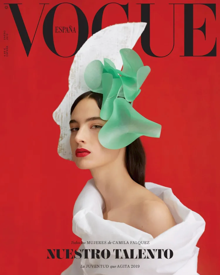

The two designs I chose to critique are Vogue magazine covers, one of them being from Vogue Spain and the other being Vogue Philipines. Both of these designs work extremely well as they draw the viewer in upon first glance. The magazine covers draw in curiosity and attention from the viewer, both of the covers are strong statement pieces that stand out amongst other magazine covers. Of the graphic design principles discussed in class, The Spain cover uses the design principles of Negative space, proximity, contrast, color, and hierarchy. The Spain cover is presented with a bold red color as the background and then it is contrasted by the image of a model wearing a white geometric dress and headpiece that creates a stark contrast against the red further creating the illusion of background and foreground. The type on the cover is minimal and has been very tastefully selected as it plays along with the soft geometric visuals of the model’s garments. The use of negative space on the cover design contributes to the powerful imagery and effective cover design. The use of negative space allows the design to breathe and contributes further to the balanced and powerful look. The design uses type hierarchy by placing importance on the magazine’s subject matter, and placing all other text in lighter weight fonts. The only changes I could see adjusting on this design to possibly make it stronger is by breaking up the text grouping so the three lines of type can exist on their own as single pieces. Bringing the “Todas las MUJERES de CAMILA FALQUEZ” to the top left under the Vogue logo and the “La JUVENTUD que AGITA 2019” to the top right under the Vogue logo might bring further emphasis on the the content.
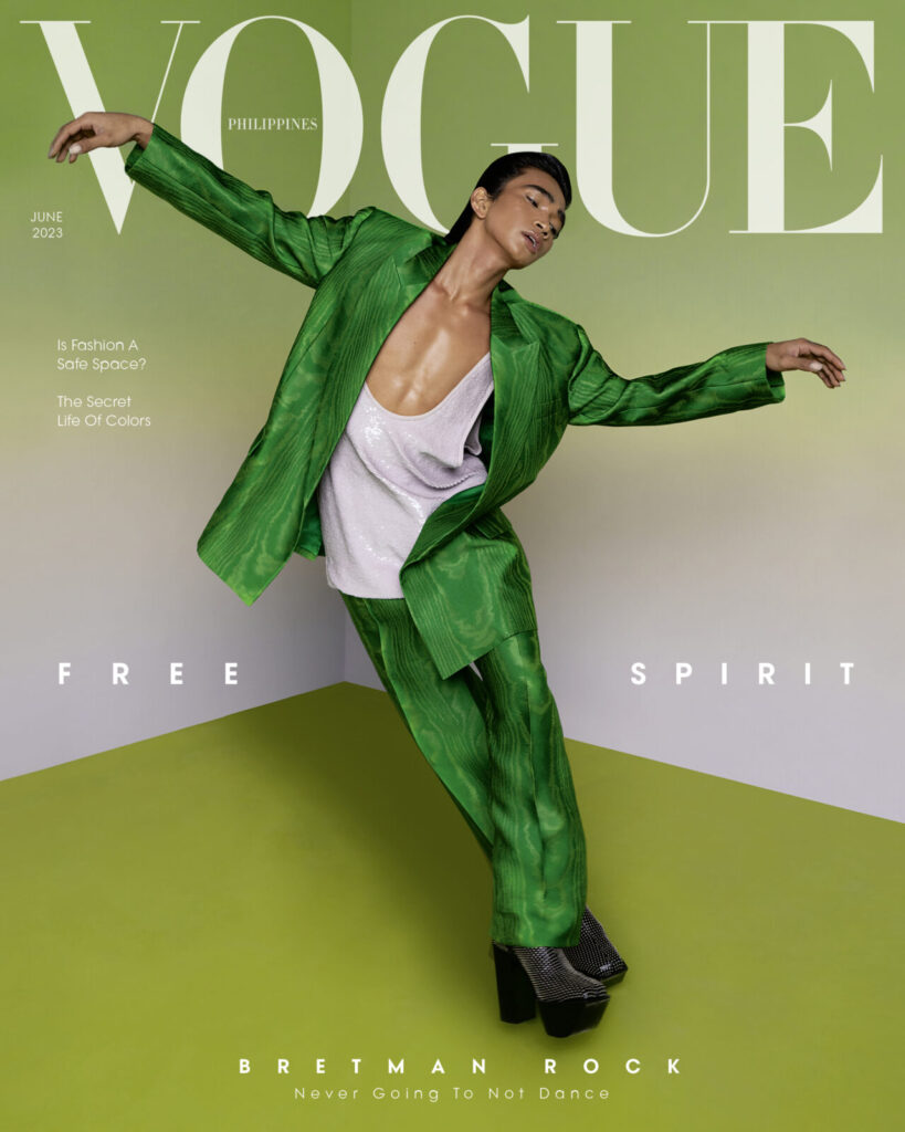
The second design I chose is the Vogue Philippines cover with Bretman Rock featured. The cover has been designed to look playful yet elegant, it conveys joy and bright energy with its use of bright colors, soft lines and playful freeflowing gestures. The elements of design used on this cover are contrast, negative space, color, proximity, and alignment. The use of a bright green color amongst lots of negative space creates the illusion of a bright playful space. The use of flowy clothing on the model along with the pose create a feeling of free flowing energy that exists nicely alongside the sharp edges of the background creating balance. Their minimal use of type also contributes the elevated looj of the design. The placement of the type has been carefully placed alongside the models body bringing further emphasize to the movement in the models pose and drawing the viewers eye further along the cover and assists in the dynamic energetic look of the design. The careful planning and use of proximity between each letter is among the design choices that also contribute to the look and illusion of space and feeling of ease. Using all design principles meticulously and intentionally will create powerful strong designs, as evident in both of these covers.
